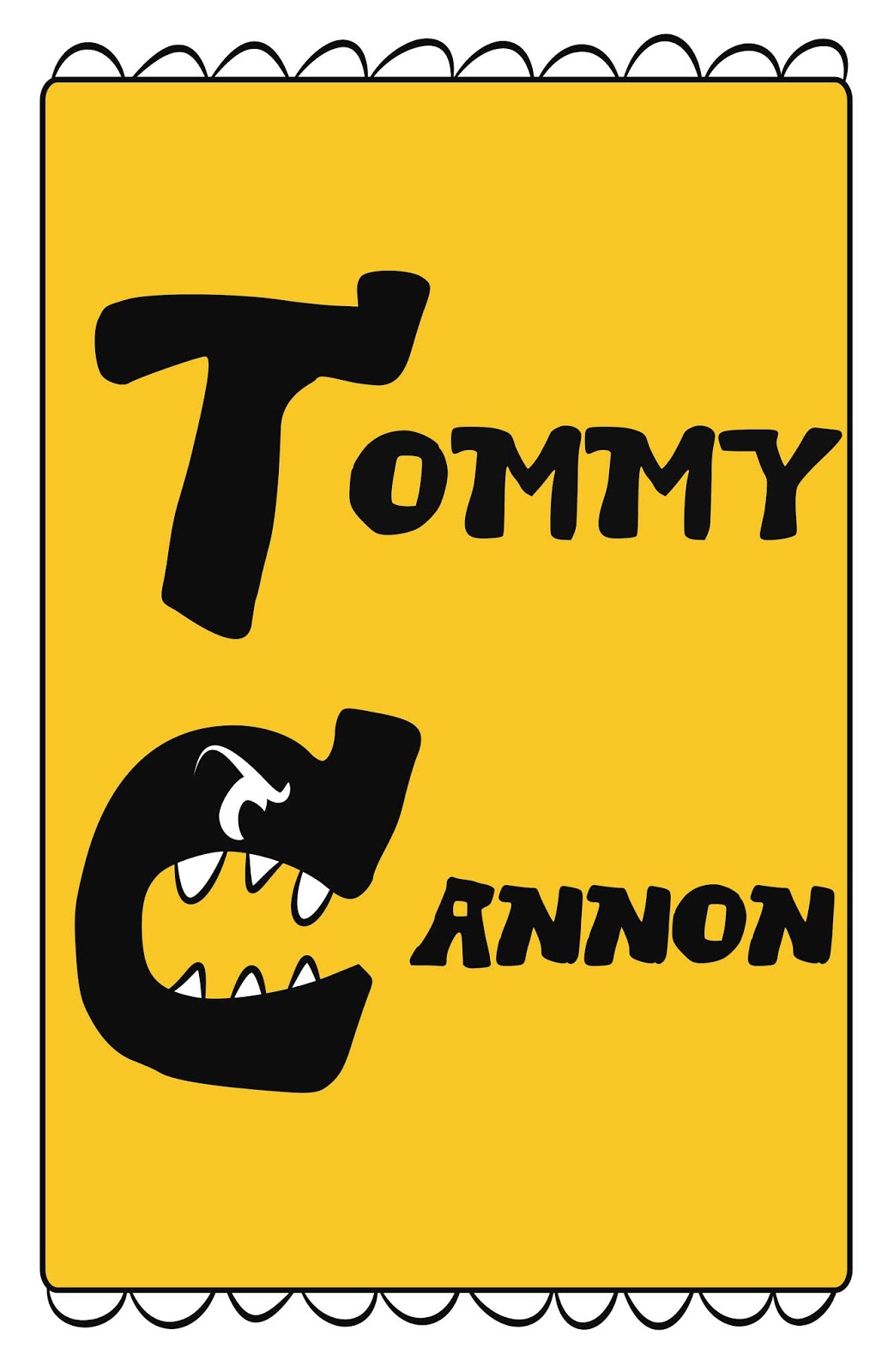
Here it is. I'm pretty happy with it. The "T" was modified. I was able to convert the text to a brush stroke in the graphic program and I slimmed it down. And, I added the "C" Monster! I like this "C" Monster because of the serif it has this triceratops/ rhino feel to it.
So it is only three colors, but it communicates a lot about me. The mustard packet, the monster, the snow cone party font all combine to tell my story as an artist.
It's bright, bizarre, and I love it. Thank you for joining me on this journey.
No comments:
Post a Comment